CLUSTERS OF OPPORTUNITY
 |
||
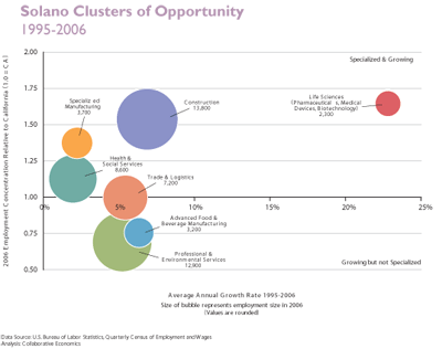
| What Does this Mean? Solano County’s major industry clusters are diverse and most are more concentrated relative to the state and growing faster. These clusters pay higher wages and generate demand for support services. |
||
How to Read a Bubble Chart The size of the bubble shows the employment size for the industry cluster. The x-axis displays the annual average growth rate each industry cluster grew or declined between 1995 and 2006. The y-axis displays the employment concentration of each industry cluster and its ratio to California’s employment in a cluster. A concentration greater than one indicates Solano County has relatively more employment in that cluster as compared to the State’s economy as a whole. |
||
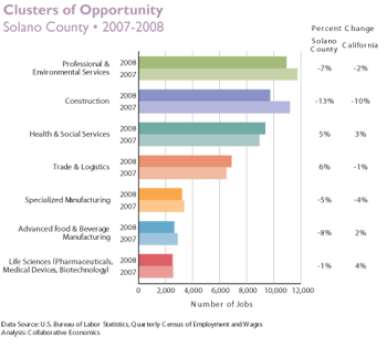 |
Job Growth!
|
|